Sunday, 30 March 2014

What makes Annie Leibovitz photos so iconic?


To first answer that question, you need to know a bit about Annie Leibovitz to start with.  Annie Leibovitz was born on 2nd October 1949. Leibovitz worked at Rolling Stones magazine in the 1970s, then moving on to Vanity Fair in 1983. Known for taking portraits of famous musician, political figure and athletics. Leibovitz went as tour photographer with the Rolling Stones band. Leibovitz is mostly based in America, her work is featured in advertising campaigns and magazines as well.

One of her famous Rolling Stone covers was of Meryl Streep. When I first saw this image, it makes me wonder how Meryl Streep pulled so much skin from her face. As a viewer this is the attraction of this photo. In this photo Meryl Streep face is painted white to match the white shirt she is wearing. This for me made the photo more theatrical.

Then, Leibovitz takes a photo of a nude pregnant Demi Moore for the front cover of Vanity Fair. This photo, I would say is very iconic because it was so unique for its time and had never been done before.  The photo for me is one of Annie Leibovitz best because she not afraid to think out the box with her ideas.

One of Leibovitz most daring shoot was Whoopi Goldberg in a bath full of milk. This photograph is my favourite because as a viewer we don’t see all Whoopi Goldberg, just her face, arms and legs. What I like most is Whoopi Goldberg’s skin colour against the milk in the bath that makes for such a high contrast.

Annie Leibovitz still takes such iconic photos today, her recent photo was of Kim Kardashian and Kanye West before they get married in the summer on the American Vogue cover. This is such a beautiful shot of the couple and I really like the dress that Kim is wear as well.

For me, what makes Annie Leibovitz so iconic is that she never scared to take a risk to create brilliant photographic imagery. Leibovitz will go down in history as a great photographer who takes excellent photos.

Bibliography

Websites

Annie Liebovitz biography - http://jb5746a.wordpress.com/2011/10/03/annie-leibovitz-2/ - accessed on 30/03/14

Images
Meryl Streep - http://jb5746a.wordpress.com/2011/10/03/annie-leibovitz-2/ - accessed on 30/03/14


Wednesday, 26 March 2014

What is the relationship between semiotics and advertising campaigns?


Semiotics is about sign and symbols and the interpretation of them.  I have always wondered about the relationship between semiotics and advertising campaigns, because if you think about the two things, they are very similar. Both trying to convey a message, to sell us something or communicate something, for example: Traffic lights (to help us cross safely) and dangerous street signs (to avoid us getting hurt).

While researching more about semiotics, there was one quote that stood out for me; “Every time we interpret an image around us (to understand what signifies) whether consciously or not, we are using the tools of semiotics to understand its signification, or meaning.” (Marita Sturken/ Lisa Cartwright (2009). Practices of Looking, An Introduction to Visual Culture, p27). I totally agree with this statement because we are always trying to understand the world around us. Through the symbols and signs around us, and there are certain symbols that we recognise like the big M for McDonalds which we associate with fast food.   

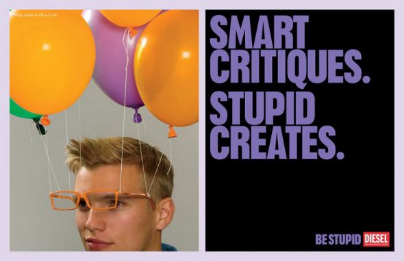
These two adverts Diesel’s Be Stupid and Elige Vivir Sano are very different in their approaches to the layout, image and text. For the Diesel’s Be Stupid campaign, there is a man wearing orange glasses, attached to them are different colour balloons with the words “Smart Critiques. Stupid Creates.” The choice of words speaks to Diesel’s target market (20 – 40 year olds). I really think this advert is quite dynamic because Diesel’s whole ethos is having fun and enjoy yourself.

In comparison, the Elige Vivir Sano campaign was of a strong banana crushing the box of fries with the quote “Exercise your will power”. This I think was an excellent play on words and the illustration demonstrates that beautifully. When I first saw this advert I thought it was very aggressively laid out.I learnt that the relationship between adverting campaigns and semiotics are that they are both similar and are interlinked with other.

Bibliography 

Books
Marita Sturken/ Lisa Cartwright (2009), Practices of Looking,An Introduction to Visual Culture, 2nd edition, USA,Oxford university press, p27

Websites - Images
Diesel’s Be Stupid campaign - http://www.shockblast.net/diesels-best-ad-campaigns/     - accessed 23/03/14
Elige Vivir Sano campaign - http://www.trendhunter.com/trends/elige-vivir-sano-campaign  - accessed 23/03/14


Tuesday, 11 March 2014

Movie review of 12 Years a Slave

12 Years a Slave poster


For me this film, 12 Years a Slave was one that I wanted to watch for a while. After watching it, it was greater than what I expected. The story in a nutshell was about Solomon Northup, a free black man in 1840s who was sold into slavery. The film shows this journey from being free to becoming a slave to being free again.  In my view, the all-star cast were all really well suited to their roles. This story was adapted to film and was also true story of Solomon Northup. This book was originally published in 1853.

12 Years of Slave has won numerous awards, deservedly so;

Oscars 2014
·         Best motion picture of the year
·         Best Performance by an Actress in a Supporting Role - Lupita Nyong'o 
·         Best Writing, Adapted Screenplay - John Ridley 
Golden Globes 2014
·         Best motion picture – Drama
Bafta 2014 
·         Best film
·         Best Leading Actor - Chiwetel Ejiofor 

From this film, I learnt a lot about slavery in the past, and this has made my want to read the book to gain more in-depth knowledge from the Solomon Northup, himself. I think this film should be used in school across the world as a tool to help other learn about the slavery in America at that time.

Bibliography

Websites
Book published year - http://www.historyvshollywood.com/reelfaces/12-years-a-slave.php  - accessed 10/03/14
Film
12 Years a Slave, (2014) Directed by Steve McQueen, USA, Plan B Entertainment, Cinema [film]


Sunday, 9 March 2014

Wildlife Photographer of the Year exhibition at the Natural History Museum

Wildlife Photographer of the Year at Tring


This exhibition is of the entrants that entered the Wildlife Photographer of the Year in 2013. The exhibition was separated into different categories, grand title winners, adult winner, and young winners. For each of those categories there was 4 awards; commended, highly commended, runner up and winner. The entrants were from different countries and the photos were taken from places all round the world. For me, this is what made this exhibition so great.

The exhibition was laid out into the different categories, with the black walls creating a contrast against the vivid photographs. There were a lot of brilliant photographs, but there was one that caught my eye. It was the “Eye of a Toad” by Lukasz Bozycki, this photograph has a shallow depth of field with only the Toad and the water surrounding it was in focus. I thing this photo was taken at sun set because the light is orange. Looking at this photo, I would describe the light as 2000 k on the Kelvin scale.

Throughout the exhibition there were photos not only of animals but of landscapes. Ice Aurora by Ellen Anon is one of my other favourites, because the colours in this photo are so clear and sharp. Looking at this photo makes me want to take more landscape shots for my portfolio. If your there at the right place at the right time you can capture something as spectacular as this is.

Overall, I was really amazed by the level of talent that I saw in this exhibition, which has inspire me to do some of my own shots. I would definitely highly recommend this exhibition to everyone, from amateur to professional photographer, or those who just love photography in general.  

Bibliography


Museum Visit 
BBC Worldwide (Wildlife Photographer of the Year ) The Natural History Museum (2013 annual competition entrants)

Images


Saturday, 8 March 2014

“The Great War in Portraits” – National Portrait Gallery


This free exhibition is about the World War One (1914 -1918), depicted through painted, filmed and photographic portraits. As I was looking around at the exhibition, I got a sense of how many people were involved.  One of the images that caught my eye was the college of 40 different faces from soldiers to nurses.  This for me gave a more personal meaning to exhibition. Each portrait as good as the other, but as collection are very great pieces of photography.


The layout of the exhibition was anti-clockwise, and divided into section:
1. Torso in Metal from the rock drill, bronze 1913-14,
2. Royalty and the assassin
3. Leaders and followers
4. The valiant and the dammed
5. Fact & Fiction – The Battle of the Somme in film 


My favourite part of the exhibition were section 3, William Orpen charcoal of “Royal Irish Fusiliers: 'Just come from the Chemical Works, Roeux: 21st May 1917” because there weren’t a lot of charcoal images and thought that use of tone and contrast was really excellent.

Also, I think that highlight was section 5, the film of The Battle of the Somme, which showed soldiers in the war going about their every day business. It was really interesting seeing that being there is not much footage of World War One. 

Overall, I thought that this gallery exhibition was really useful. I learn a lot about the main people who were involved in The Great War. I would recommend this exhibition to anyone who interested in history, patriotic or loves media of all kinds.

Bibliography 

Museum Visit
Moorhouse, Paul, (The Great War in Portraits) The National Portrait Gallery, (01/03/2014).

Images
Poster of Gallery exhibition - http://www.npg.org.uk -  Accessed on 06/02/14